Surveys are a secret weapon of email engagement.
Unfortunately, it’s not easy to create, design and deploy digital surveys that get great results.
What’s the best way to word questions? How many questions should you ask? What sort of design and layout will grab the most eyeballs? How will you analyze and share results?
[Report: Email best practices that will catapult your results]
There are many considerations and possibilities, but the payoff from surveys is often worth the work. As Alissa Warne writes at MarketingProfs: “Surveys are one of the most important digital touchpoints that brands can have with a customer. Getting them right can elicit valuable feedback to drive product and company direction.”
The trick is in the clicks—or lack thereof.
“Most email surveys have buttons that say, ‘Take Survey’ or ‘Start,’ which take the user to a new browser tab and kick off a standalone survey,” writes Rohan Ayyar at Business 2 Community. “Trouble is, not enough people bother clicking on this CTA button, resulting in poor response rates and thin data.”
The solution is to embed surveys within emails. Doing so increases the likelihood that more readers will fill out your survey—which helps marketers collect more crucial data.
The benefits of embedding surveys
“By including the entire survey inside the body of the email, marketers can prevent the inevitable user drop-offs and collect exponentially higher responses than they would have otherwise,” Ayyar writes. Ayyar cites data showing that embedded surveys increase response rates by 125 percent compared with traditional surveys.
“Embedded surveys provide a better user experience and consistently increase response rates,” says Jana Barret at GetFeedback. “When you embed an event survey in an HTML email or on a webpage, it’s right there—respondents don’t need to go elsewhere. Embedded surveys increase visibility and minimize the user effort required to respond.”
Ayyar suggests that email marketers use embedded surveys for soliciting product reviews and customer satisfaction ratings, as well as completing customer profiles and assessing user interest. His tips for success include:
- Keep the survey short and simple.
- Experiment with radio buttons, open text fields, check boxes and buttons to keep the survey visually inviting and easy to take.
- Check whether your email marketing platform supports embedded surveys. (Most do.)
- Check how your survey renders on the most popular email clients before sending one out. (It’s smart to check how your survey renders on different device sizes, too.)
The team at QuestionPro, a company that specializes in developing online surveys, suggests that embedded surveys work best when they meet these criteria:
- They use strong visuals. (Check out this example.)
- The question text gives enough context, so the user doesn’t have to read the question twice.
- There is no “bait and switch” with surprise additional questions.
- The email message is personalized.
Begin with the answers in mind
Once you’ve decided to create a survey, you’ll probably want to start writing questions right away. That’s understandable, but it’s not the best approach.
Instead, take time to decide what you want your answers to tell you, advises Stephanie Beadell at Zapier. “Just like you start a building project with a blueprint—and don’t just begin pouring concrete whenever you decide you want a new building—your survey should start with the answers you need, and then you’ll be better prepared to make the questions that will provide those questions.”
In addition, Beadell shares these tips for crafting effective survey questions:
- Use simple, direct language. Questions should be short and clear.
- Be specific. Precisely worded questions yield the most valuable answers.
- Break down big ideas into multiple questions. Don’t cram too much into one question.
- Avoid leading questions. Don’t let your bias creep into the way questions are worded.
- Ask one thing per question. Avoid words such as “and” and “or.”
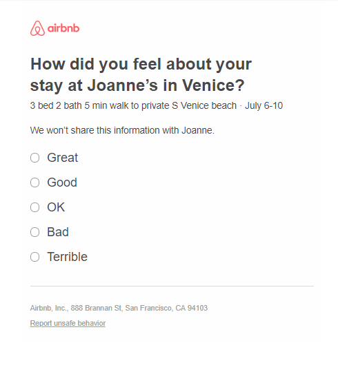
For example, the embedded survey below from Airbnb takes just a few seconds to complete, and it provides valuable data about the customer’s experience at a property.

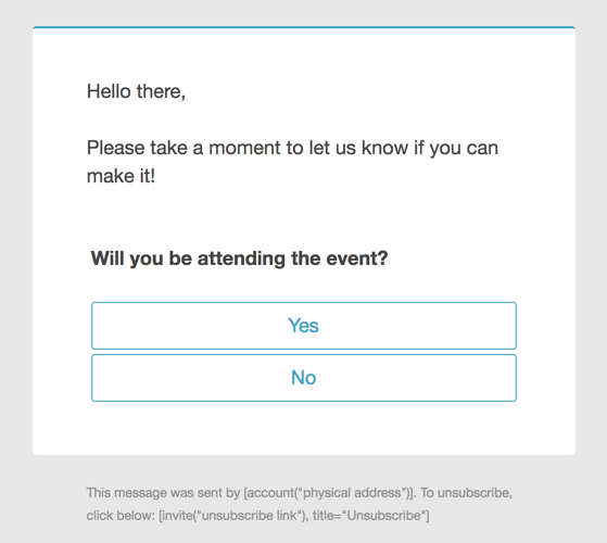
Here’s another good example from SurveyGizmo. It’s straightforward, quick and concise.

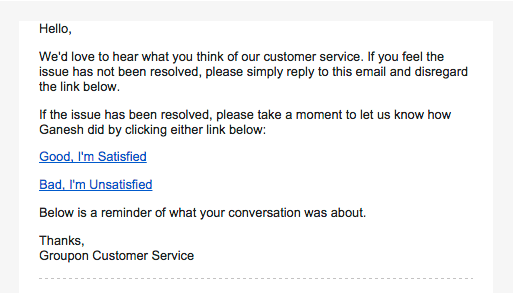
This embedded survey below from Groupon lets the customer provide immediate feedback on the performance of a specific customer service representative.

Whichever design or direction you determine, err on the side of brevity and user-friendliness. You’ll get more responses, better results and more data to fuel your marketing efforts.
A version of this post first appeared on the Movable Ink blog.
(Image via)
from PR Daily News Feed https://ift.tt/2xQhwha
No comments:
Post a Comment